PVF
PVF Logo Lab
Eighteen ways to make three letters move.
Geometric, condensed, modular, outlined, and expressive studies built around one requirement: the initials must still read as PVF.
PVF
PVF
P
V
F
V
F
PVF
PVF
PVF
PVF
PVF
PVF
PVF
PVF·
PVF
PVF
[PVF]
PVF
PVF
PVF
Showing all 18 studies.
Construction rules
Variation without visual drift.
Every study changes one major variable while holding the reading order and core proportions in view. The result is a controlled field of possibilities, not a pile of unrelated logos.
Preserve letter cues
The P keeps a readable bowl, the V keeps a decisive convergence, and the F retains enough horizontal structure to remain distinct.
Repeat geometry
Angles, cuts, stem widths, counters, and spacing units recur across the mark so the letters behave as one designed object.
Test reduction
Fine details are simplified before they collapse. Compact and micro variants protect recognition at interface and favicon sizes.
Separate modes
Monochrome forms carry the identity; expressive color and motion remain optional layers for launch and social contexts.
Beyond the mark
A logo needs a surrounding voice.
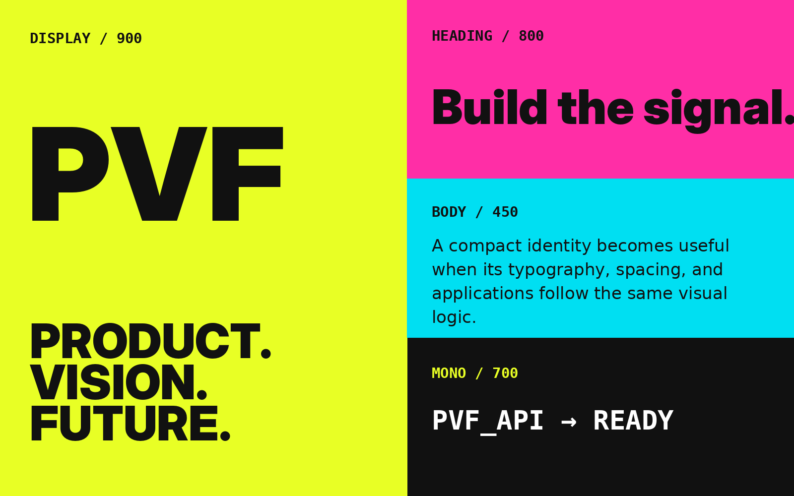
The letterform studies become useful when they connect to headings, interface labels, code samples, color tokens, and consistent spacing. The PVF type system turns those decisions into reusable roles.
Open Type Systems