Product
Clear, usable structure. The mark must survive headers, app icons, documentation, and developer tools—not only a presentation slide.
PVF.xyz / Typographic identity study
A bold typographic logo showcase for a future-facing .xyz brand—built to move from app icon to launch page without losing its signal.
One compact initialism
PVF is intentionally open-ended. This concept uses Product / Vision / Future as a working interpretation, then turns those three ideas into a flexible visual language for modern digital products.
Clear, usable structure. The mark must survive headers, app icons, documentation, and developer tools—not only a presentation slide.
A memorable point of view. Shared angles, strong spacing, and decisive reductions give the identity a recognizable visual grammar.
Adaptable by design. Full, compact, and micro forms let the system evolve across new surfaces without becoming a different brand.
Selected marks
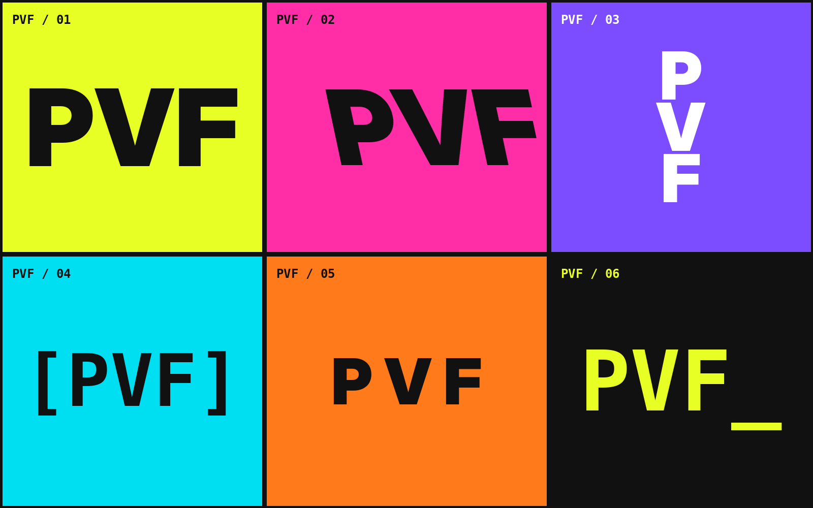
Each treatment keeps the PVF sequence visible while changing density, motion, and digital character.
Compressed, direct, launch-ready.
Directional energy through diagonal terminals.
High-contrast structure for large display use.
A compact editorial badge.
Developer-tool precision with a live cursor cue.
Airy spacing for calm platform branding.
Responsive identity
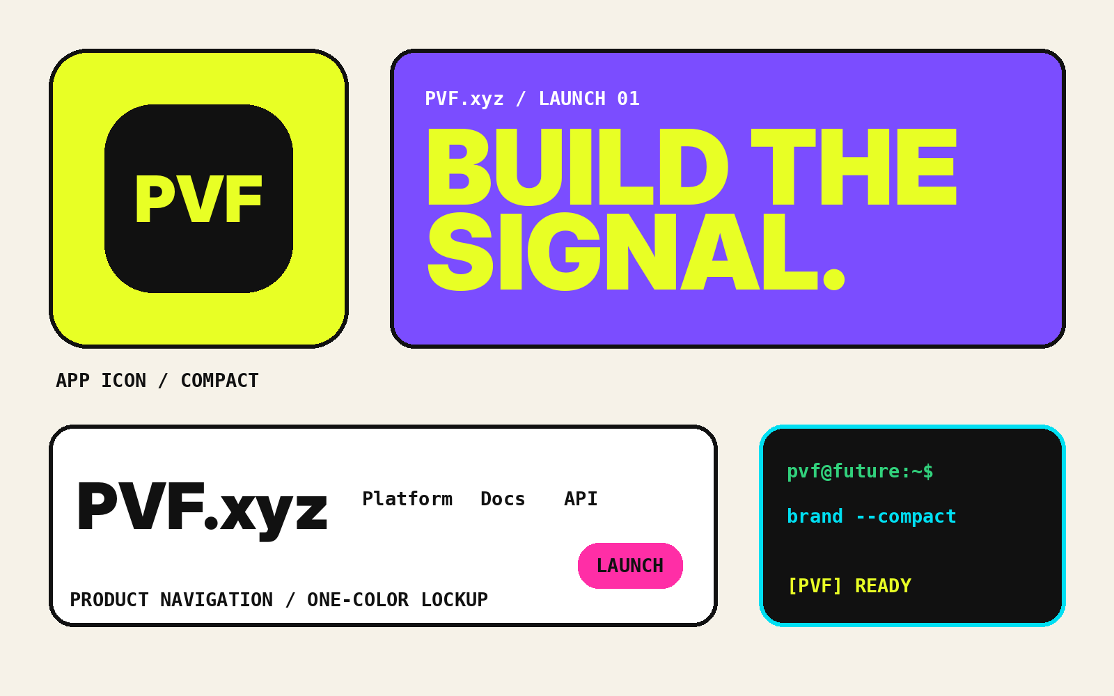
The PVF system is tested as a family, not a single artboard. It includes a full wordmark, compact monogram, micro mark, one-color mode, reversed mode, and expressive campaign treatments.
The PVF Type Journal
Long-form guides connect the visible mark to spacing, accessibility, SVG delivery, responsive variants, variable fonts, and design-system governance.
A final prelaunch review covering strategy, recognition, clearance, assets, accessibility, implementation, and postlaunch ownership.
Read the guide
A practical path from visual identity decisions to semantic tokens, reusable components, versioned assets, and cross-team governance.
Read the guide
A role-based method for selecting, loading, and applying typography across SaaS headlines, interface previews, proof points, and long-form content.
Read the guideFrequently asked
The letters are intentionally open to interpretation. This study uses Product / Vision / Future as the primary working phrase, while the logo system remains useful for other PVF meanings.
No. PVF.xyz is presented as an independent typographic identity study and reference library. The examples demonstrate a possible brand system without claiming client work, awards, or commercial results.
Digital brands appear in wide headers, square avatars, tiny favicons, product interfaces, and large campaign graphics. A responsive family preserves recognition in each context instead of forcing one drawing everywhere.
Distinctiveness usually comes from a small set of repeatable relationships: spacing, shared geometry, custom joins, cuts, counters, and proportions. The feature should remain recognizable without making the letters unreadable.
No. PVF.xyz is a fully static website built with HTML, compiled Tailwind CSS, custom CSS, and lightweight JavaScript for navigation and gallery filtering.
Email [email protected]. The contact page intentionally uses a direct email link instead of a data-entry form.
PVF / Product Vision Future